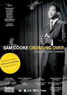
 Sam Cooke: Crossing Over premieres Monday, January 11 at 9 p.m. on PBS as part of their American Masters series.
I worked on this documentary for my good friend, director John Antonelli, on and off for about 5 years. There were many iterations as he awaited final funding but I'm thrilled that he was able to stick with it, complete the project, and have it presented on such a prestigious showcase as American Masters.
For the finished show, I did some editing work, as well as designing the opening title and animating many of the photo moves that appear throughout.
As you can see in the title sequence below, we wanted to treat the photos with a subtle 3D effect to add interest and movement to the still photos that are a big part of telling the story of this influential soul singer.
This particular 3D effect has become very popular in recent years and has appeared on numerous documentaries that have aired on Discovery channel, History Channel and PBS. I'd like to to give you a glimpse behind the scenes, into the process that creates some of the eye-catching animation that you see on tv everyday.
To achieve this effect, I used the industry stalwart tools: Photoshop and After Effects.
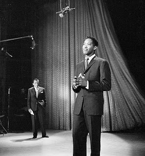 First, I was given a hi-resolution scan of the original photo of Sam Cooke on the Ed Sullivan show. John and I discussed the themes of his documentary and agreed that this image did a great job of visually representing the ideas of Cooke crossing over from his gospel roots, to a white pop music culture.
I then worked on the photo in Photoshop by cleaning up the dust and scratches and adjusting the levels so the tones were a bit darker and richer.
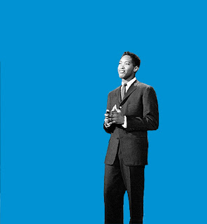 For this effect to work, I must create two separate "plates" from the photo - a background plate, and a foreground plate. Essentially, I "cut out" what I want to pop into the foreground by creating a matte in Photoshop and isolating Sam from the background.
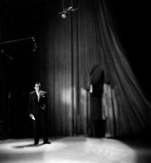 Once I've cut him out, I then need to go back to the background plate and touch-up the photo to create what would be behind Sam if he wasn't standing there in the photo. In other words, when the camera moves around in the image, there has to be something behind Sam that is revealed as the perspective changes. To do this I use the Clone Stamp Tool to copy sections of the photo and paint them into the hole I created by cutting Sam out. I also may use the brush tool to paint as well. You can see that I don't need to fix the entire hole I created, just enough to create the illusion that what's behind Sam is a complete curtain and floor.
I also decided to blur and darken the background to make Sam "pop" even more.
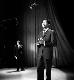 Once that's all done, I now have a photoshop file with two layers - the top layer with Sam cut out, and the bottom layer with the background darkened and additional curtains and floor painted-in.
Now it's time to import this file into After Effects and create the movement.
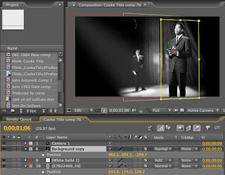 In After Effects, I create a new composition ("comp") and bring the file with these layers into that comp. I then let After Effects know that I want the layers to exist in three-dimensional space (X,Y and Z axis) by checking the 3D option next to the layers.
You'll see that I also added spotlight effect to break up some of the negative space on the left.
I then add a new "camera" to the comp which is what I will use to animate the image. Essentially, I will move the camera around in the image and what the camera "sees" is what I will see.
Next I need to separate the layers in Z space so that the top layer exists a certain distance above the bottom layer. This is a trial and error process to determine how "high" I want the top layer to be. I move the camera around a bit to see how the perspective changes. For this project, John and I determined that we wanted to the 3D effect to be fairly subtle and unobtrusive, so I only set the top layer a little bit above the bottom layer.
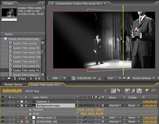 However, since I've moved the top layer in Z space, it now appears out of position and much larger than it did before. To correct this, I need to scale it back down and reposition it back to it's original composition.
This too takes some trial and error.
Now that the image is how I want it, I can create my move by setting keyframes for my camera at the starting point, moving the camera through the image until I get something I like, and then setting keyframes at the end point. This process takes quite a bit of fidgeting to get the motion and the timing just right.
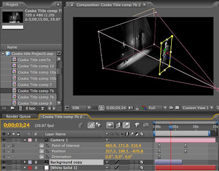 You can see from this viewpoint that this is not a "true" 3D effect, there is no depth or "thickness" to anything - it is more like a pop-up book - but it is effective nonetheless.
You'll notice that in the final title sequence there is a lot more going on - flash-jumps, text effects and color and texture effects on Cooke's face at the end, all of which introduced a lot more work to get to the final product that you'll see on tv.
As you watch the show, keep a look out for more of these 3D photo moves - some of the photos have standard pans and zooms, but we sprinkled these 3D moves throughout the film at key moments and on particularly striking images.
I hope this has given you a little insight into the work I do and into the process of creating animated effects for video and film work.

No comments:
Post a Comment